
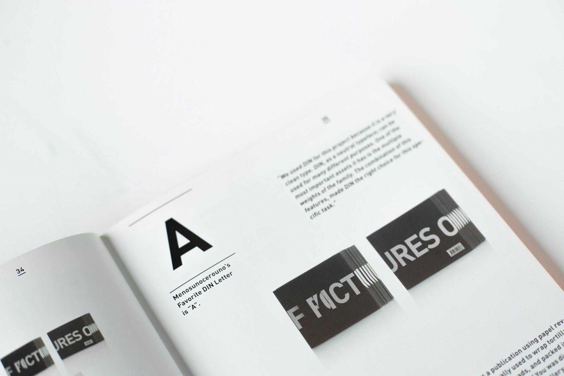
Typography makes or breaks your design’s readability and visual flow. A strong hierarchy guides viewers through content naturally, with size, weight, and spacing working together. Start with no more than three type sizes for body, subheadings, and headlines—more creates chaos rather than clarity.
Contrast is your friend. Pair a bold sans-serif headline with a readable serif body font, or vice versa. But contrast isn’t just about font choice; it’s about weight, scale, and strategic use of color. Line spacing matters enormously—body text needs breathing room while headlines can sit tighter. Test your hierarchy by squinting at your design; the right elements should pop even when details blur.
Leave a Reply