
Category: Graphic Design
-
The Grid System: Structure That Sets You Free
by
Grids seem restrictive until you realize they’re the foundation of visual harmony. Every magazine, website, and professional design you admire uses an underlying grid system. It creates alignment, establishes rhythm, and makes decisions easier by providing a framework for placement. Start with a simple column grid—even just two or three columns transforms layouts from amateur…
-
Color Theory for Non-Designers: A Practical Approach
by
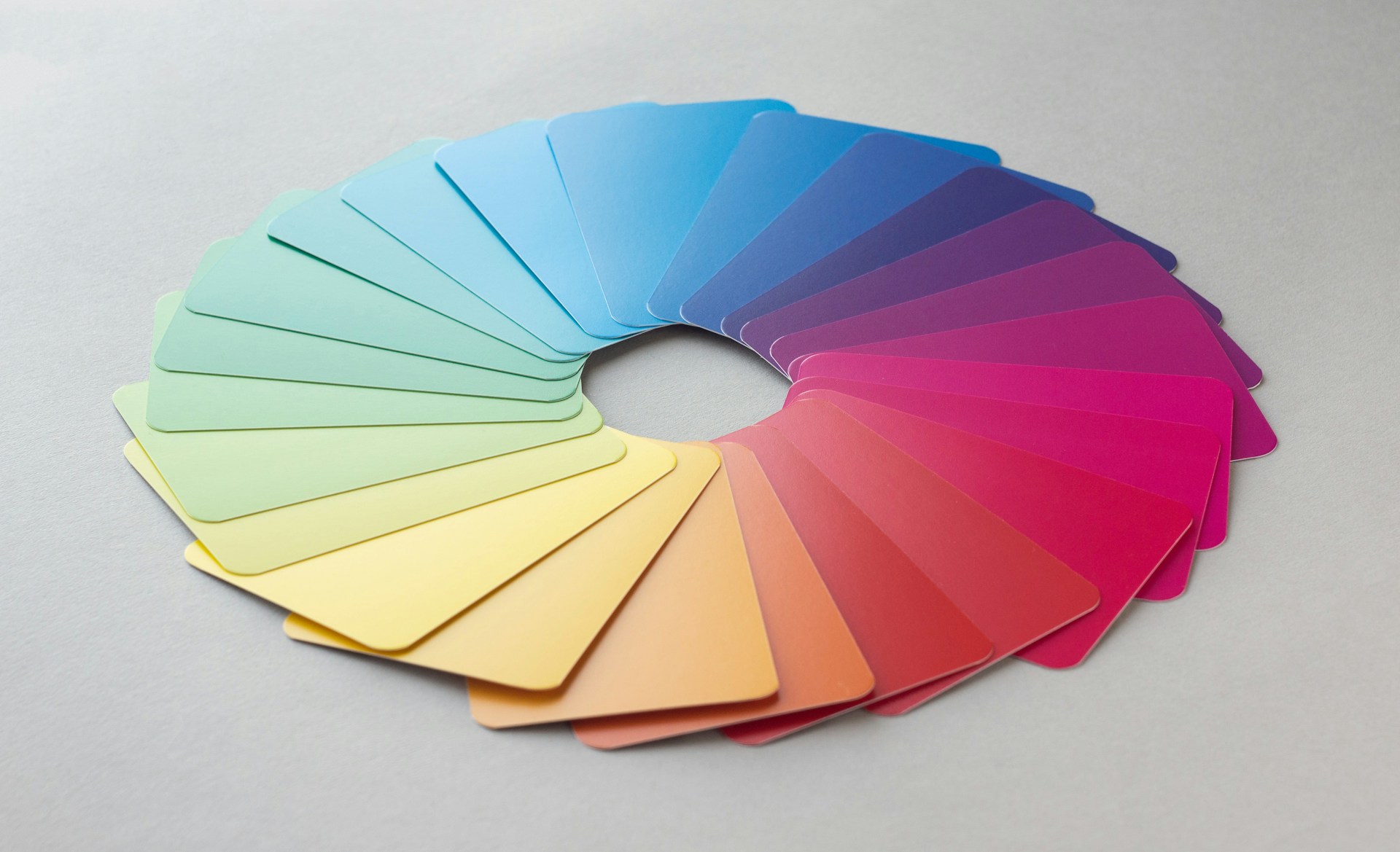
You don’t need to be a designer to use color effectively. Start with the 60-30-10 rule: 60% dominant color, 30% secondary color, and 10% accent. This creates visual balance without overwhelming viewers. Your dominant color sets the mood—blues for trust, greens for growth, warm tones for energy. Color psychology matters, but context matters more. Red…
-
Typography Hierarchies That Actually Work
by
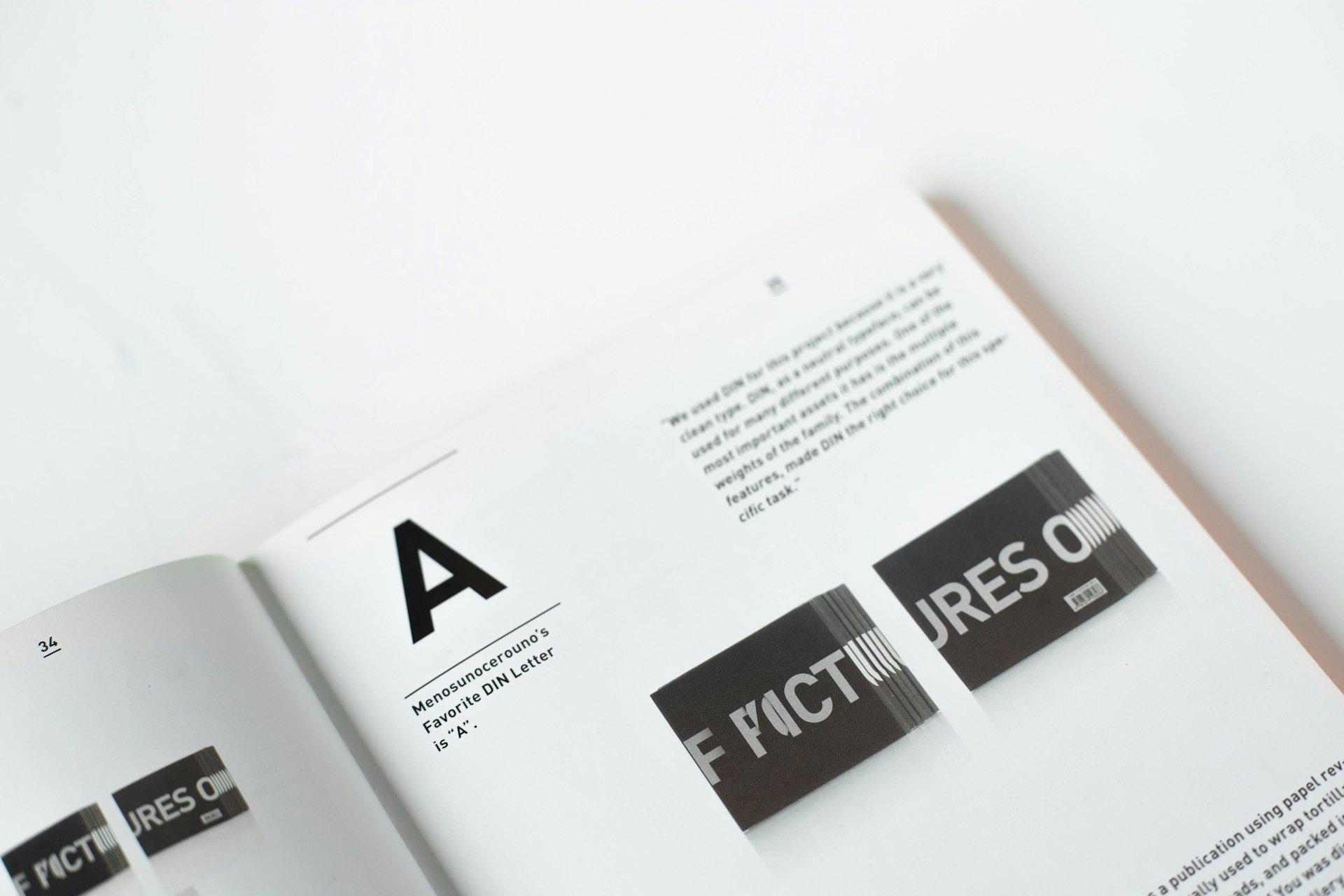
Typography makes or breaks your design’s readability and visual flow. A strong hierarchy guides viewers through content naturally, with size, weight, and spacing working together. Start with no more than three type sizes for body, subheadings, and headlines—more creates chaos rather than clarity. Contrast is your friend. Pair a bold sans-serif headline with a readable…