
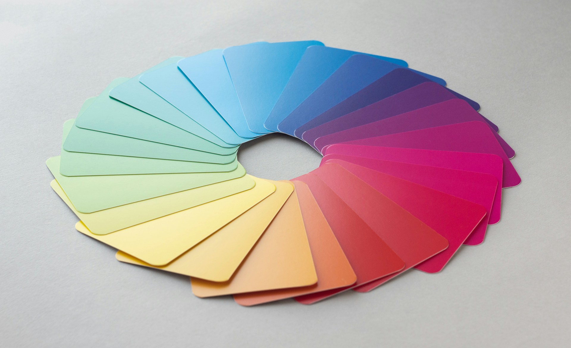
You don’t need to be a designer to use color effectively. Start with the 60-30-10 rule: 60% dominant color, 30% secondary color, and 10% accent. This creates visual balance without overwhelming viewers. Your dominant color sets the mood—blues for trust, greens for growth, warm tones for energy.
Color psychology matters, but context matters more. Red means danger in Western cultures but celebration in Eastern ones. Instead of following rigid rules, consider your audience and test your choices. Use tools like Adobe Color or Coolors to generate harmonious palettes based on complementary, analogous, or triadic schemes. When in doubt, reduce saturation—muted tones feel more sophisticated than vibrant primaries in most applications.



Leave a Reply